
Color Chart: The Joys of a Classic Green Home
Our monthly series asks: How do you bring color into luxury design? Green lends itself to older properties, thanks to its historic links, writes Jill Krasny
Some homes make a lasting impression while others quickly fade from the mind. The design scheme is always a factor. Used with care, yellow can be uplifting and pink is surprisingly grounding, while green—which our series on color in luxury design turns to next—is perfectly suited to old-world interiors, given its rich history.
In ancient Egypt, the color was tied to life and vegetation, but also to the afterlife. Tomb paintings and artifacts feature green pigment and verdigris, and Osiris, the Egyptian god of fertility, death and resurrection, was often shown with green skin.
Meanwhile, in 18th- and 19-century Europe, the color came to symbolize wealth and power, says Jessica Iwaniec, the design director of Pembrooke & Ives, a New York-based interior design firm. “Emerald green is definitely a standout you would see on walls [of the period],” she says, while rich jewel tones appeared in everything from velvet furniture to drapery, she adds.
Today, Iwaniec says she tends to see clients choosing lighter shades of green when it comes to paint, while deeper shades remain a popular choice for textiles. Yellows and oranges work well with green due to their earthy tones. “I think about the leaves changing colors and the different variations you might see in the fall,” she advises on the most successful color combinations.
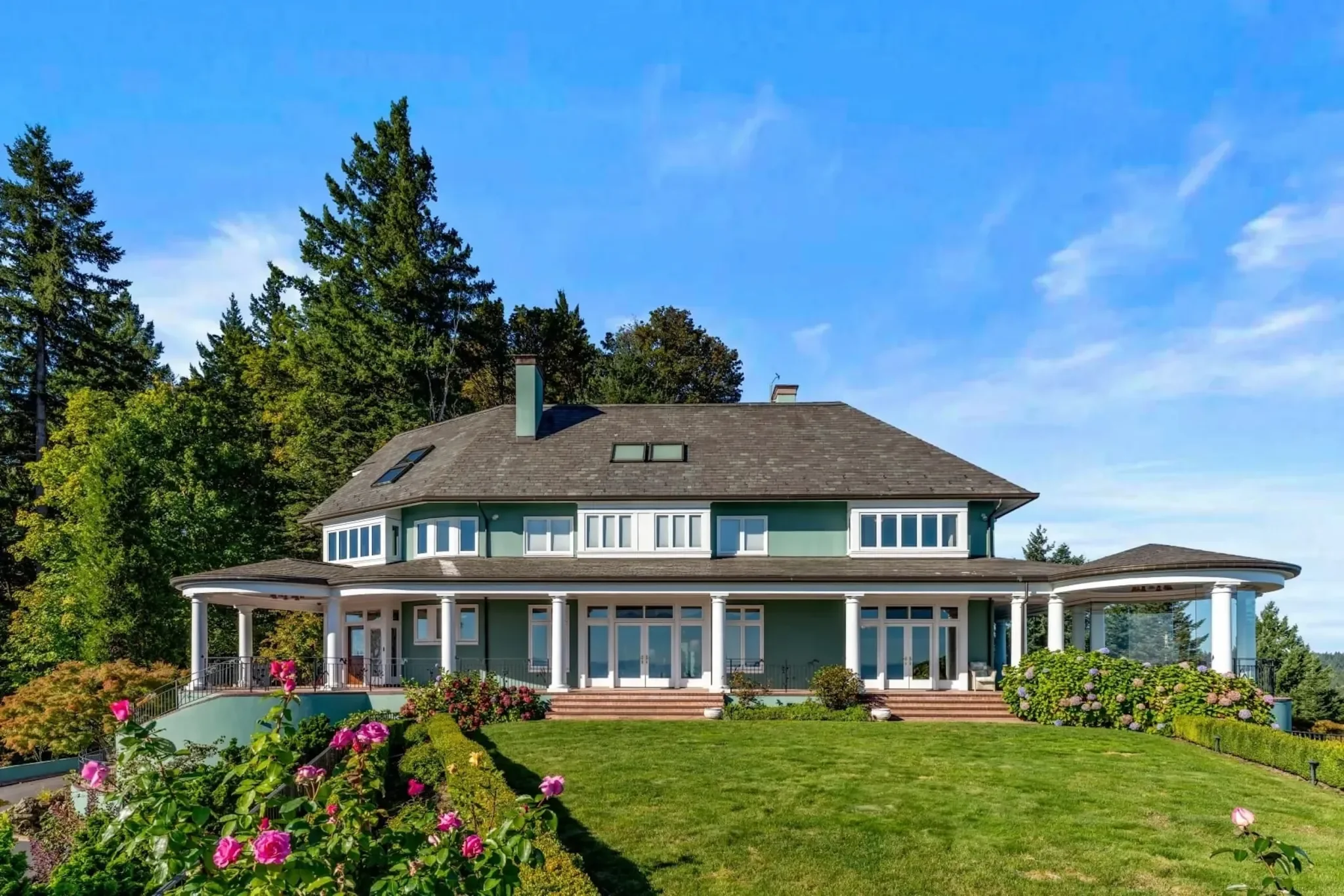
The paintwork of this estate in prestigious King’s Heights in Portland, Oregon, complements the myriad colors of its garden. “This green blends in with the surrounding landscape but brings out the details of the architecture, too,” says Iwaniec. It also draws out the white components. The home has a sense of timelessness, despite the exterior being painted a teal-leaning hue that is not common on the U.S. West Coast. “You might encounter it in New England,” she says.
Dark and bright shades of green can feel overpowering in warmer climates and Iwaniec warns also against pairing them with red, which can feel too Christmassy. But lighter shades of green are almost adjacent to neutrals, making them ideal for contemporary homes where light is prized.
She cites a recent project on Shelter Island, New York, featuring a serene sage green with a high-gloss finish that accentuated the woods outside.
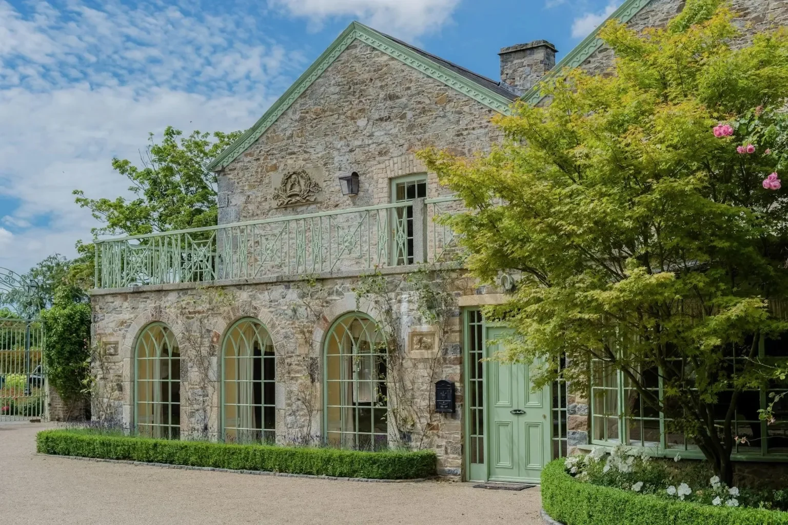
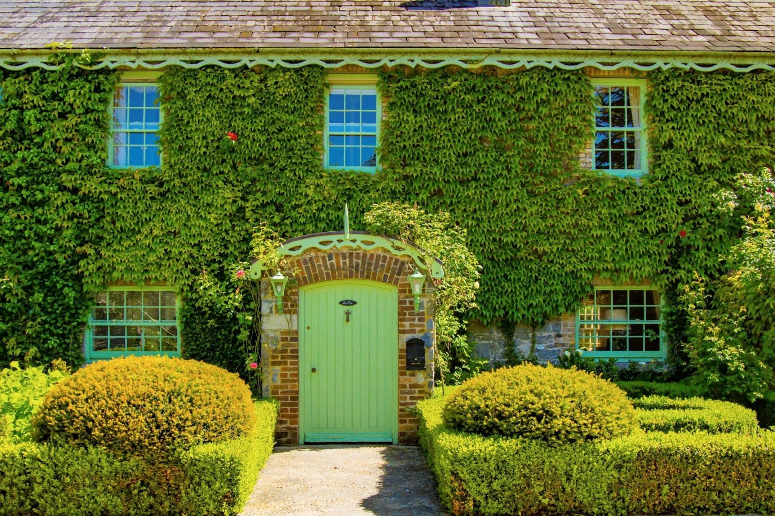
The Village at Lyons, a completely remodeled 20-acre luxury resort in County Kildare, half an hour from Dublin, likewise plays off its rolling pastoral landscape with subtle green detailing across the piece, particularly on windows, doors and balconies. Lush climbing vines transport you to older interiors in Europe, says Iwaniec, who likens the site’s meticulously landscaped gardens and courtyards to the floral designs of English textile designer William Morris.
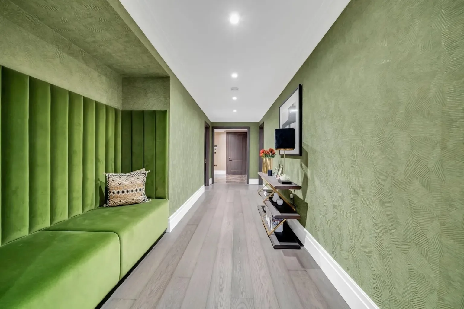
By contrast, a spacious central London apartment in a Grade II listed building, a stone’s throw from Buckingham Palace, features neutral colors throughout, except for one monochromatic room. Here, designer David Linley has deployed a channel-tufted wall panel and bench in acid green that creates a “dramatic, moody environment,” says Iwaniec. Adding further drama: the wall upholstery, which enhances the feeling of being enveloped by the soft green textures.
Explore our Color Chart series, from zingy orange, bold red and joyful pink to calming white, crowd-pleasing blue and uplifting yellow